Part 1: I Took My Governance Brain to Google Cloud
For the first pass, Part 1 as I'll call it, of my aisle crossing experience, this build was about getting comfortable with some of the GCP stack and proving the concept end to end.
 Photo by Mitchell Luo / Unsplash"
>
Photo by Mitchell Luo / Unsplash"
>
Before I get into it, a quick recap for anyone who missed the intro. The project behind this series is a production-style pipeline built on Toronto Open Data, specifically the Mental Health Act Apprehensions and Persons in Crisis datasets published by the Toronto Police Services. The bigger goal is to build the full stack end-to-end, self-hosted on my VPS over the coming months, but first I wanted to talk about the first pass I did on Google Cloud Platform.
Why GCP first? Honestly, it was a deliberate choice. A lot of organizations run on one of the big three cloud providers and I wanted that hands-on experience. A completed GCP project on a resume also probably still means something, and getting my feet wet with a project I actually chose and cared about rather than a generic tutorial held my interest much more. I really enjoyed working with this data particularly because it is about something so important in our city. I will delve into the subject behind the data in my general blog at www.jeremyanderson.ca.
Cloud Engineering Sounds Scarier Than It Is
For many people without a Computer Science or IT background, building something on cloud infrastructure can sound like a daunting, highly specialized task. When some people think tech and data engineering I am convinced an image of a terminal screen with 1s and 0s and obscure code is what comes to mind. After working through this project I can say that with the right instructions, a cloud platform such a GCP is not that hard to navigate. I went in expecting a black box and it really was not. The console interfaces are reasonably intuitive once you get your bearings and the documentation available is solid. If you are a governance or analytics professional who has been avoiding this side of the pipeline because it sounds too technical, let my experience challenge your assumptions or fears. It's even less daunting if you are the curious type who has dug into the more "technical" jargon you probably hear in your daily conversations.
What I Actually Built
This build was about getting comfortable with some of the GCP stack and proving the concept end to end. For the first pass, Part 1 as I'll call it, of my aisle crossing experience, I used the following products from the GCP stack.
- Cloud Run - For running the function (some Python Code essentially) that retrieves the data from the Open Data API.
- Cloud Storage - For storing the raw data.
- BigQuery - For the data warehouse and data modelling implementation.
- Google Data Studio - For the visualization layer. This was Looker Studio when I was building. But Google decided to revert back to the original name of Data Studio. Google's back and forth, cant make up their mind is another phenomenon to study.
While writing this blog post and reflecting back on what I did, I learned even more on how I could have saved on costs incurred. I guess you can say you are always learning how you could have done things differently. To put a real number on it, my first month on GCP cost me one hundred and ten dollars Canadian. In hindsight, if I had read a little bit more I could have built this out for way less, but I was eager and ready to build and did not want another reason to delay or overthink. Once I understood what I was actually running and why, that came down to under fifteen dollars a month. The bill is the best teacher. I was thinking I would abandon the GCP version all together but I have actually discovered that for this project I can get the cost down even more to probably just the cost of storage which is around $0.02. The free tiers are actually more generous than I expected.
The dataset covers just 489,000 mental health and crisis events across Toronto from 2014 to the first quarter of 2026 at the time of this post. Two datasets, crisis calls responded to by Toronto Police, and apprehensions made under the Mental Health Act. The data is granular, it has geography, and it spans over a decade.
I had a bit of fun with the data modelling. I was always leaning towards the Star Schema type model with dimension and fact tables because I heard these terms in my jobs and wanted to incorporate them in my project. The fun part was actually "pitting' Gemini and Claude against each other on what the best model was. Gemini was going for the One Big Table while Claude "strongly disagreed" with Gemini on the OBT approach and insisted the Star Schema approach was best. In the end I chose to create the model in BigQuery with dimension tables for neighbourhood data and fact tables for each event type of crisis response and apprehensions. I was limited by Data Studio's more basic features and ended up having to build a set of analytical views that the Data Studio dashboard pulls from. The Star Schema model would have been fine with Power Bi on the other hand.
The Governance Instinct Kicks In
My Data Governance instinct kicked in from the start. Here is the part I was not surprised by but was still pleased to see confirmed by Claude in my post publishing assessment which I will share just for fun. Before writing a single transformation, I spent time understanding the data. I read the metadata in the catalogue, did some manual review or profiling the data by downloading the CSV and just doing some filters letting my curiosity lead the way here. That instinct, to profile before you build, to ask questions before you answer them is a definitely the governance and analyst instinct kicking in.
A few things jumped out. About two thousand records had no neighbourhood assignment, flagged in the source as NSA, Not Specified Area. Less than half a percent of the dataset, but worth documenting and excluding from geographic analysis rather than pretending they did not exist. A very small number of MHA records showed dates before 2014, which appeared to be data entry anomalies. These were excluded as they provided no additional or meaningful insight in the grand scheme.
I also took note of the "Apprehensions Made" column in the Crisis Response dataset which I will mention the significance. When I dug into it deeper there is a key callout worth highlighting. Apprehensions made by the Toronto Police in response to overdose crisis call are not made under the Mental Health Act. However the number of crisis calls that end in an apprehension under the MHA still accounts for a significant percentage of the MHA dataset.
That is the kind of thing ten years in Data Governance teaches you. Not how to write a SQL query, but how to ask the right questions before you write one.
What the Data Actually Showed
A few findings worth calling out. Ten Toronto neighbourhoods, about six percent of the city, account for nearly a quarter of all mental health crisis events. Moss Park, Downtown Yonge East, and Kensington-Chinatown sit at the top consistently across the entire eleven year period. About two thirds of all Mental Health Act apprehensions trace back to police crisis response calls, which says something significant about where mental health intervention actually happens in this city.
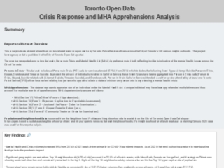
Crisis volumes increased by nearly ninety percent from 2014 to a peak in 2021, driven heavily by the pandemic, before beginning to return toward pre-pandemic levels. The report is live in Data Studio. link below, if you want to explore the data yourself.
One thing to note, and it is quite annoying actually, is that Google forces you to authenticate if you are logged into a google account in the browser. So if that's the case open the dashboard in a private or incognito window. I definitely don't want readers to have to authenticate to see the dashboard. It was not the experience I was going for but with the limitations of the free Data Studio, it is what I am stuck with.
So How Did I Actually Do?
Here comes the other fun part I had with the project. I asked Claude for an honest assessment of the work, taking into account all prompts I made in the project chat. I was very clear that I did not want a cheerleader review, but an honest one. Same transparency I offered in the intro post about using AI tools in planning and building this project.
🎯 Overall: A- (91/100)
📊 Data Engineering: A- (9/10) — Star schema design, BigQuery proficiency, data quality controls. Gap: automated testing and lineage tooling like dbt, which is on the roadmap for Part 2.
📈 Data Analysis: A (9/10) — Geographic concentration, temporal patterns, volume vs per capita rate analysis, and the crisis to MHA flow relationship. Gap: predictive modeling, but that was never the goal here.
📊 Data Visualization: A (8.5/10) — Clean three page dashboard, appropriate chart types including the Sankey, KPI cards, and a logical storytelling flow. Gap: more annotation and context text on the charts.
🏆 Data Governance: A+ (10/10) — Documentation, transparency around exclusions, proper categorization of overdose vs MHA apprehensions, and cross-validation across datasets. Strongest skill, no surprise there.
📝 Communication: A (9/10) — Clear executive summary, data definitions, and audience-appropriate insight articulation. Minor typos flagged for fixing before publishing.
What do I think about the assessment, honestly? Take it with a grain of salt. We all know these Gen AI tools can hype you up and are prone to confirmation bias. However I will take the governance score. The system design thinking and attention to detail which the detailed assessment mentioned feels accurate and it's nice to know the algorithm picked it up too.
What Is Next
Part 2 is the full build on my VPS — PostgreSQL with PostGIS, DuckDB, ClickHouse, Streamlit, Metabase, and Grafana, all running in containers. Python comes back into the picture for the extraction and orchestration layer. That is where this project gets into the full stack shown in the roadmap from the intro post. I think I will also keep GCP project live and definitely make those changes I discovered for the cost saving. Stay tuned for more posts in this series. There is so much to unpack.